SHARING A FREE RESOURCE WITH THE LEARNING INDUSTRY:
CREATING A SCENARIO-BASED SOLUTION AND A NARRATED ACCOUNT
CUSTOMER PROFILE
Learnnovators is a multiple-award-winning organization that specializes in the design and development of custom learning solutions for the workplace. Learnnovators helps clients address skill and performance gaps in their workforce by creating tailor-made solutions that are aligned with their business goals.
THE REQUIREMENT
Learnnovators had worked with Clark Quinn, a recognized leader and guru in learning strategy, on a blog series about deeper e-learning design. As the next step, the two wanted to come up with something bigger and better, something that would benefit the learning community. The natural answer was to design and develop a course that puts into practice good principles of e-learning design. Not just that, it was also decided that Clark and Learnnovators would jointly ‘work out loud’ on the project, that is, reveal the thinking and the rationale behind the decisions in the project design and development process.
THE SOLUTION
The solution comprised an e-learning course on the topic: Workplace of the Future. This topic was chosen due to a couple of reasons:
- It needed urgent attention from the corporate world, and not much had been done on the topic before.
- It offered the potential to create scenarios that require complex decision making in a constrained environment.
Once the topic was decided, the modules were finalized. There are four modules in the course:
- Freeing up the flow of information
- Assigning meaningful work
- Working out loud
- Setting a safe culture
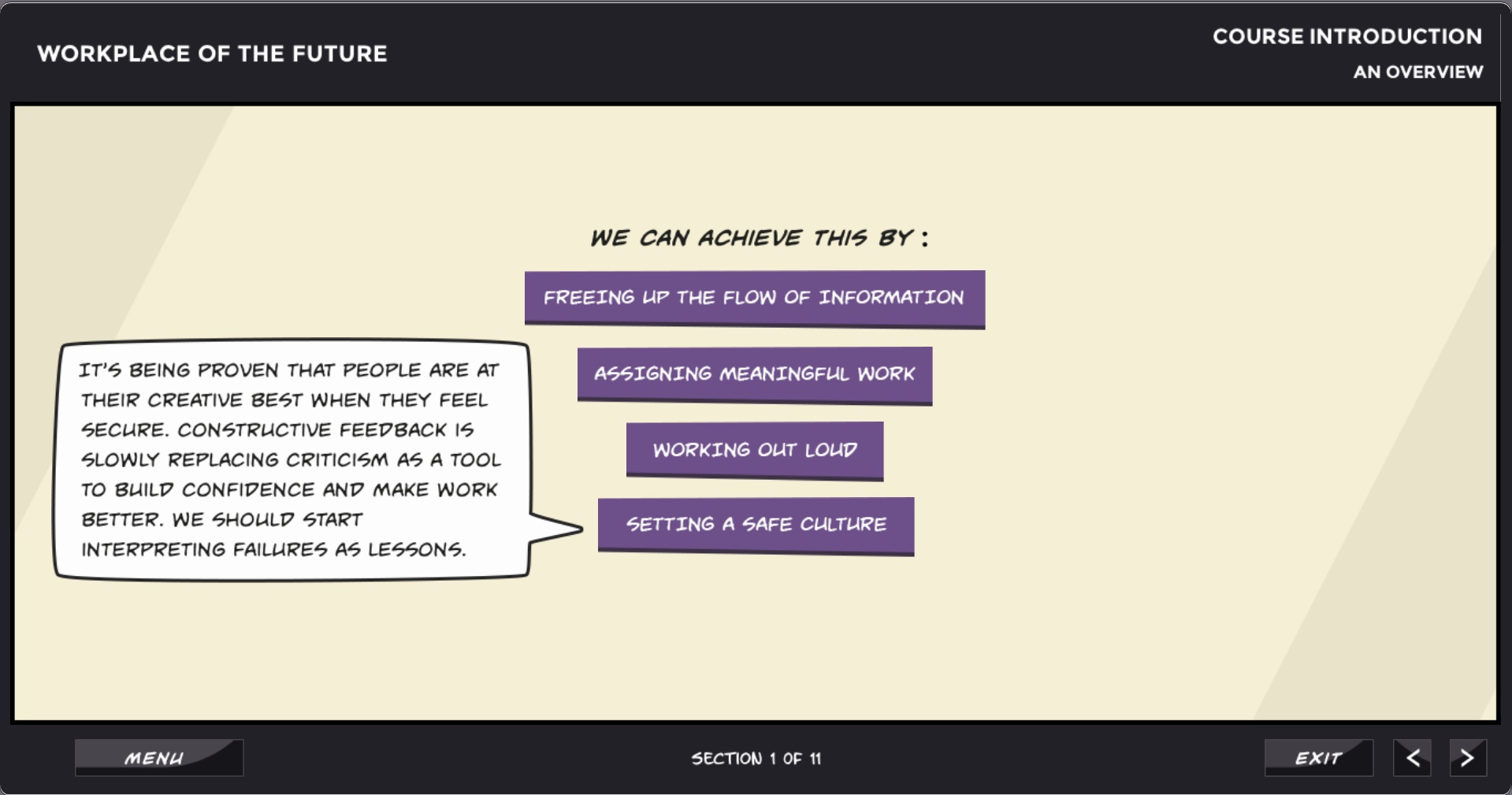
Figure 1: Image showing the list of modules
The course was, on purpose, developed under all the ‘typical’ practical constraints faced by learning design and development teams, the idea being to show that it is possible to adhere to good principles even under such constraints. The principles that were employed in the development of the course include the following:
1. ACTIVITY-CENTRIC DESIGN
The entire course is decision-based. It is full of practice activities, with minimal content that can be pulled by learners if needed.
Learners who enter the course see some initial context-setting content, and then are placed in a scenario where they need to take decisions to move the conversation forward. The ‘content’ is made available only as reference, and can be accessed if needed (not mandatory). However, the scenarios are challenging enough that learners have to access the content to understand the underlying logic of the decisions they are faced with. The decisions also include misconceptions that are likely to have been entrenched in the minds of learners.
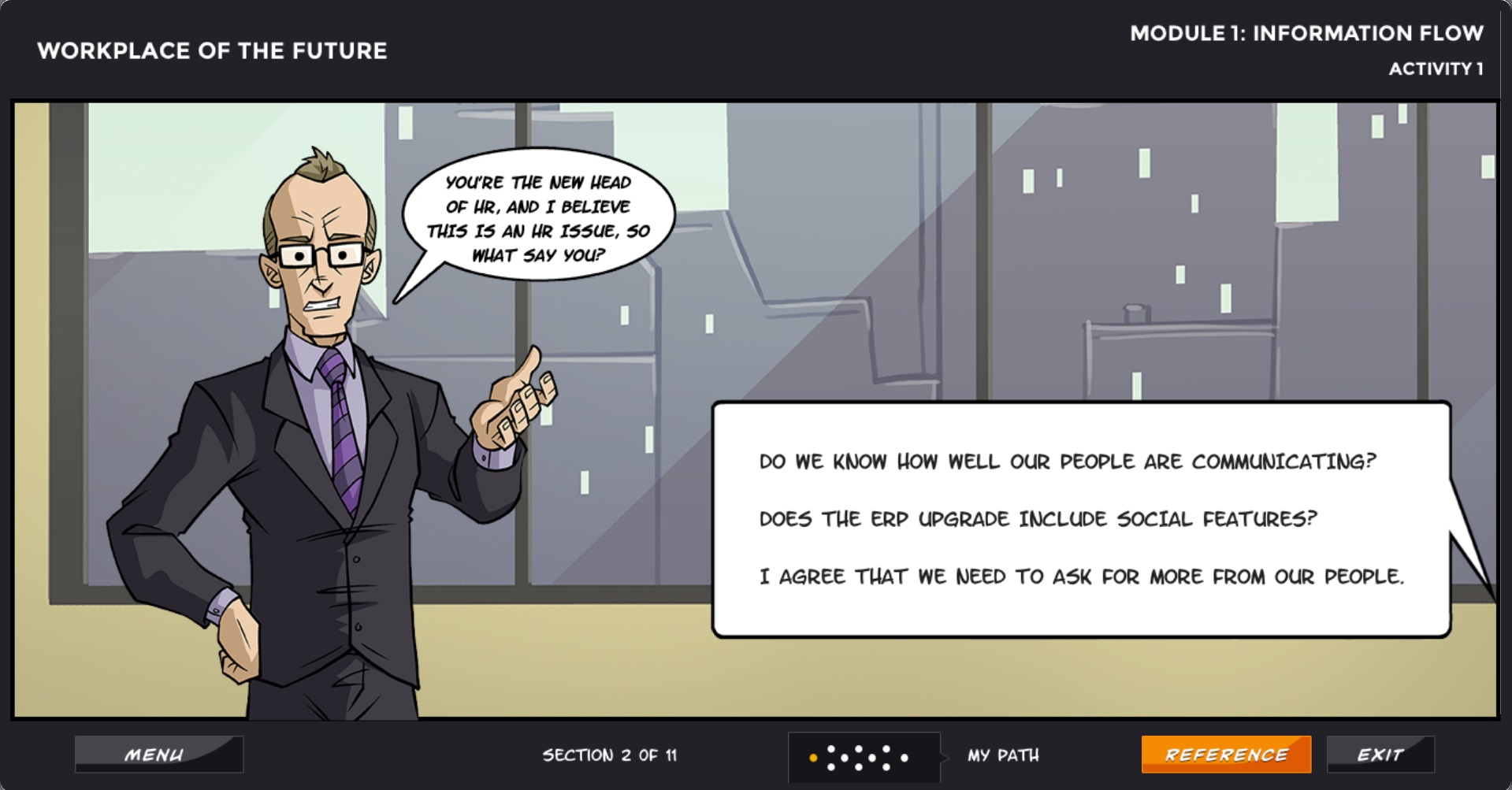
Figure 2: Image showing a decision-based branching scenario in the course
2. THE RIGHT AMOUNT OF CHALLENGE
The decision points in the scenarios are neither too easy nor too difficult. Learners need to ponder over them to make a choice, and accessing the reference content makes that decision more informed. This engages learners’ intellectual curiosity, motivating them to interact better with the course.
And, the right answer is not too obvious, to make learners want to access the content, in order to be able to take the scenario forward.
3. INTRINSIC FEEDBACK
Intrinsic feedback is provided at the end of the scenarios; that is, the consequences of the learners’ decisions are ‘shown’ to the learner once they reach an endpoint. This is provided through a simple description of what happens in the organization a few weeks / months after they reach the end, and then it is followed by an explanation of why this happened.
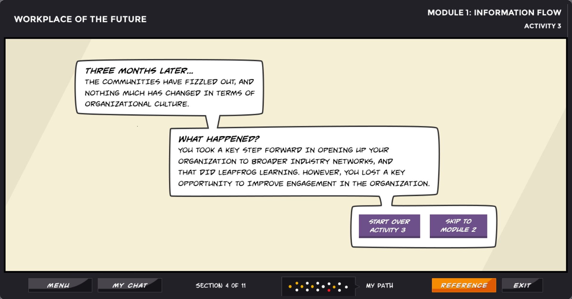
Figure 3: Image showing the end of a scenario with intrinsic and extrinsic feedback
4. NO AUDIO
The course does not have audio. This was decided on the understanding that it might be viewed in a public environment, and based on some other practical reasons.
5. VISUAL STYLE
The course uses a graphic novel approach for the visuals. It also has a fair representation of characters from different backgrounds and cultures.
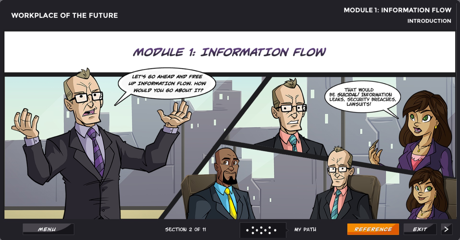
Figure 4: Image showing the visual aspects of the course
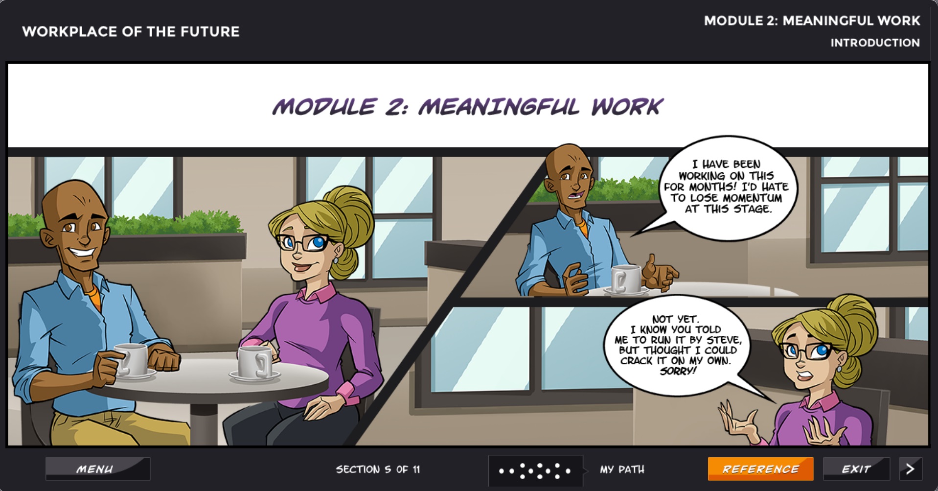
Figure 5: Image showing the visual aspects of the course
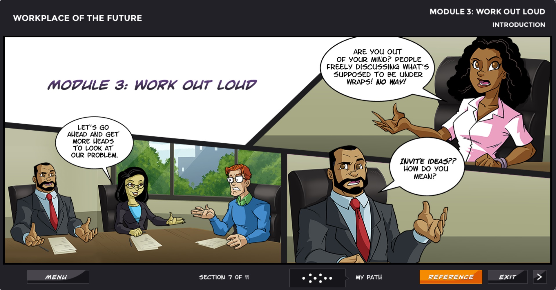
Figure 6: Image showing the visual aspects of the course
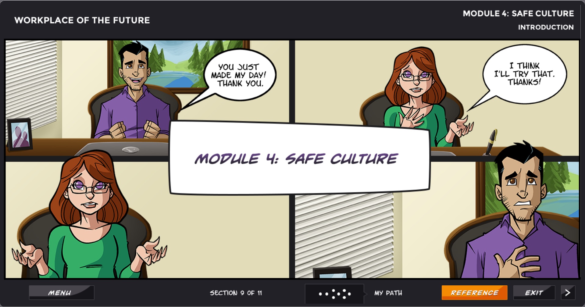
Figure 7: Image showing the visual aspects of the course
6. INTERFACE AND NAVIGATION
Learners are intelligent, independent beings, and they will be able to deduce how to navigate the course and interact with the elements. So, while the course provides an initial heads up on the navigational elements, it refrains from indicating, at every juncture, to ‘Click Next to continue’.
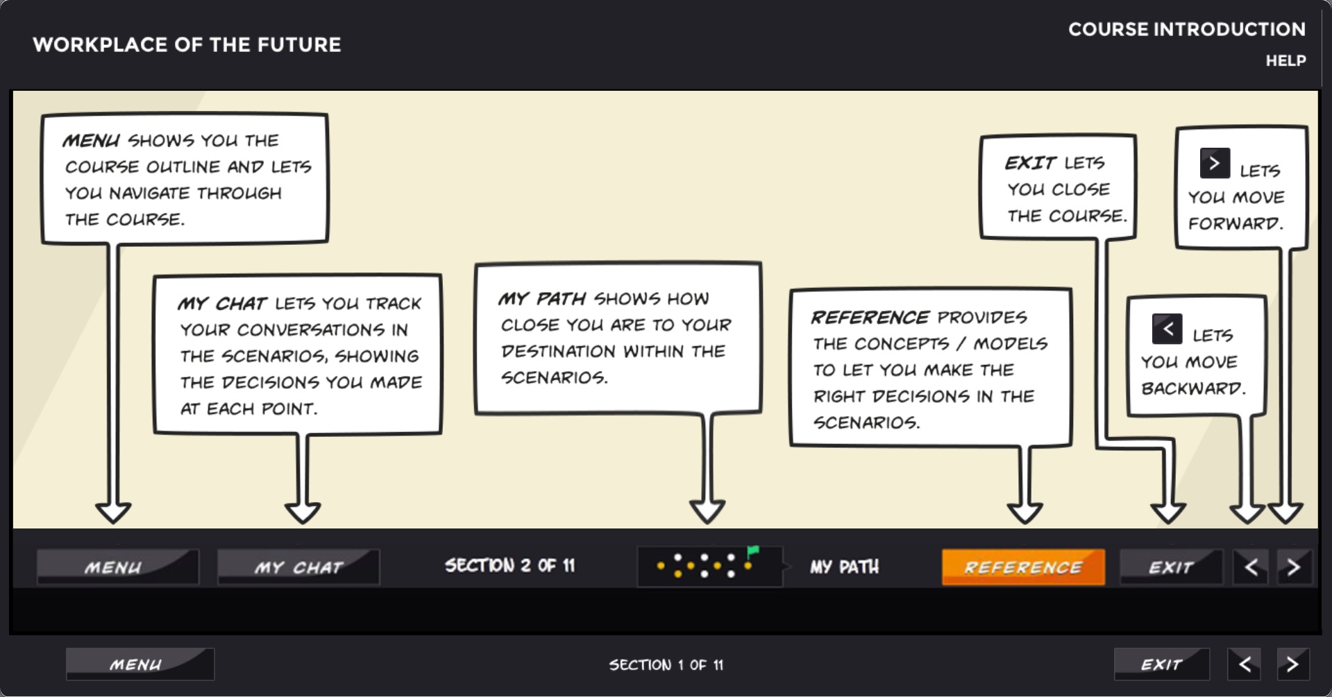
Figure 8: Image showing the navigational help screen
For other, more complex interactions, such as the following, subtle visual cues are provided:
- My Chat: Through this, learners can track the discussion in the scenario. It provides the dialog that has taken place so far in the form of a chat transcript.
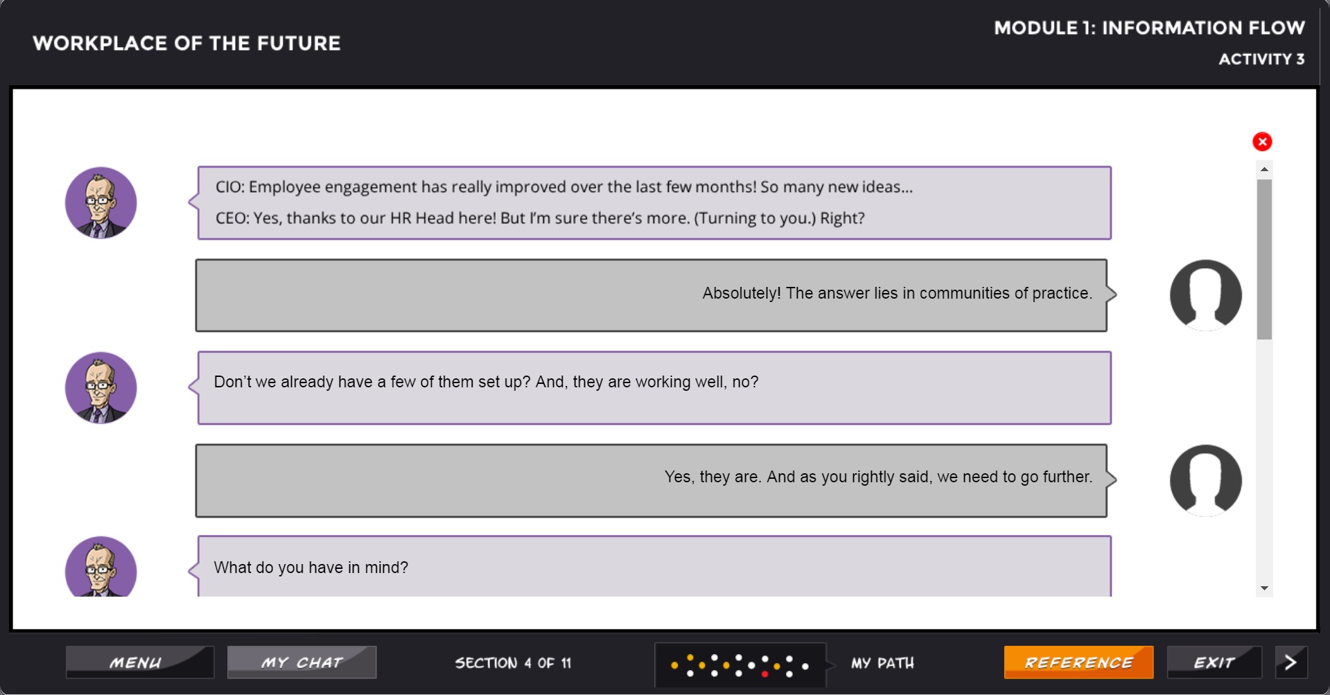
Figure 9: Image showing the My Chat feature
- My Path: This is an iconic representation of the complexity of the scenario, with a set of dots that changes color as a learner progresses along. This is to indicate to the learner that their path is not linear, and that there are multiple other paths available.
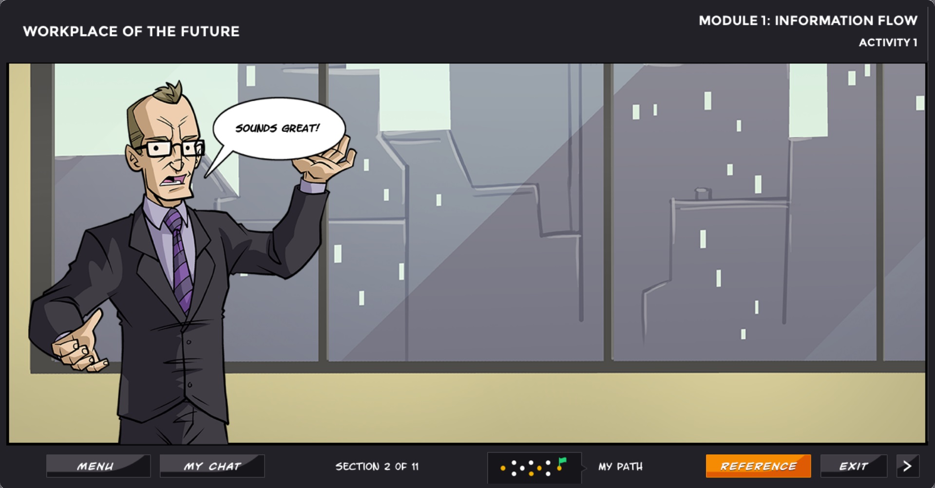
Figure 10: Image showing the My Path feature, with a green flag at the end to indicate the learner has successfully completed the scenario
- Reference: This is the content of the scenario, and is presented as a scrolling document. Learners who access the reference from a point in the scenario are taken to the section of the document that is relevant to the decision point they are in.
The course follows the open navigation model, wherein learners can move freely between the scenarios and the sections.
7. USER TESTING
This turned out to be one of the most critical components of the course design process. The feedback received from testers (a representative audience group) was deep and insightful, and this led to several improvements to the content as well as the structure of the course.
THE DELIVERY
The course, along with a series of blog posts explaining the rationale behind the design and development process, was made available, totally free of charge, on the web for anyone to see, learn from, and refer to.
The idea of hosting the course on an LMS (to track user information and progress, completion etc.) was initially considered, but then that would mean that users would feel inhibited to share their details. Therefore, it was hosted on the open web.
The project (the course + the accompanying narrative) was shared as a tribute to the late Jay Cross, a leader in informal learning and a champion of the future of work, and made available to the learning community free of charge.
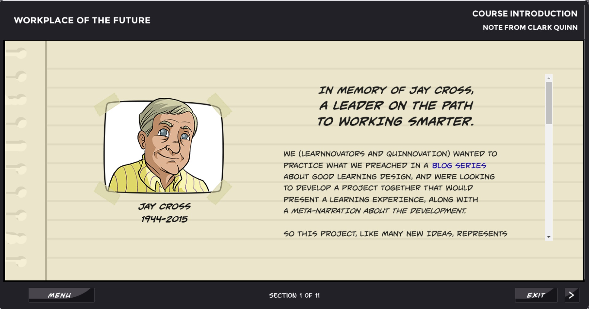
Figure 11: Image showing the page offering a tribute to Jay Cross
ADDITIONAL INFORMATION
Here is the link to the course: Workplace of the Future.
Here are the links to the blog posts written by Clark Quinn on Learning Solutions Magazine:
- Post 1 – Deeper Design: Working Out Loud
- Post 2 – Deeper Design: Beyond Traditional Instructional Design
- Post 3 – Deeper Design: Tweaking the Media
- Post 4 – Deeper Design: Putting It All Together
- Post 5 – Course Launch: Learnnovators and Quinnovation Launch Demo Course Based on Learning Design Best Principles
TOOLS / TECHNOLOGIES USED
Articulate Storyline, xAPI, JavaScript, Adobe Photoshop, Adobe Illustrator, Audacity, Microsoft Word, Microsoft PowerPoint.
AWARDS WON
- Won Platinum in the LearnX Impact Awards 2018 for “Best Free eLearning Resource”

